By Mike Koppang
Note: This article was originally published in The Avalanche Journal, Vol. 138, Summer 2025
A GOAL OF THE FORECASTING PROGRAM in Kananaskis has been trying to find different ways to innovate our risk management communication to the public in terms of avalanche danger and terrain management. The avalanche forecast has always been the foundation of this communication piece, but we have also seen advances in how we forecast and communicate following the development of the Conceptual Model of Avalanche Hazard, iconography within the bulletin, and the use of social media and video content.
Of course, trying to summarize avalanche danger into a single webpage or two-minute video is a tricky problem. Not only are we talking about problems that have high levels of uncertainty and trying to condense these issues into a more understandable, shortened format, but we are also doing this for users who range from first-timers to seasoned professionals.
Kananaskis, like all areas these days, has a very diverse user group that comes out to experience the terrain in winter. Backcountry skiers are the largest users in the
region, but ice climbers, snowshoers and hikers are also some of the many recreating in avalanche terrain. Skiing around during the past 20-or-so winters of working here, I have had the opportunity to interact with lots of people and have seen firsthand the different levels of avalanche awareness amongst the different groups. While avalanche awareness is increasing and people are better prepared than they were in the early 2000s, we still interact with many recreationists who are unaware they are in avalanche terrain.
ADOPTING ATES
The development of the Avalanche Terrain Exposure Scale following the challenging winter of 2003 was a great step forward in terms of how terrain (or, more importantly, the severity of terrain) could better relate to the avalanche bulletin. Common ski tours and popular ice climbs within our region were evaluated by forecasters and placed in one of the three terrain classifications: simple, challenging, or complex. This information was then compiled into a list and shared on our website along with the avalanche bulletin. The intention was that while planning a trip, you would consult the list to see if your trip was on there, evaluate the terrain classification you would be entering, read the bulletin, and then make an informed decision regarding the terrain and the avalanche danger.
While we knew this was an advancement in incorporating terrain into avalanche risk communication, there was a visual piece missing. I can think back to early emails between a few of us regarding potential mapping ideas and options to communicate this information in a topographical format in addition to the list. Fast forward several years to either an ISSW or a CAA Spring Conference, and I found myself fortunate enough to be discussing a presentation on automated ATES mapping that I had seen with Dr. Pascal Haegeli. We casually discussed the idea of a publicly available map to go alongside the avalanche bulletin and how interesting that would be to try.
One thing led to another and a few emails and introductions later, I found myself talking with John Sykes from Simon Fraser University about the idea of an
automatically generated ATES map overlay of the Kananaskis region to be shared publicly. John had the technical knowledge and we had the regional knowledge, as well as the website development team and users. We came up with a plan to try to develop this tool over a few months/winters for use in Kananaskis.
CREATING THE MAP
Our plan started with a polygon of the forecast region and efforts to collect vegetation overlays, detailed topographical overlays, and other geographical references that would assist in the map’s creation. John then inputted the data, applied his expertise and knowledge, and ran the model to produce an output for the region. Once the initial model or overlay was completed, we began to evaluate and examine the terrain on a more valley-to-valley scale.
One consistent error we noted was overestimation of runout zones around lakes or gravel flats. The model tended to include the entire lake or gravel bed as part of the runout due to a small interaction of avalanche terrain within a select area. Fortunately for us in our region, we were able to work closely with a GIS specialist who was able to edit some of these polygons to reflect the terrain more reliably. While this was a time-consuming part of the project that took several weeks, it enhanced the map’s accuracy.
The other question was, how often do you update the map? Foreseeably after any large change such as a fire or logging, the map would have to be reevaluated to reflect changes to avalanche potential in the terrain. So far, there has been no significant changes in the region that would affect the overlay, but we are keeping it in mind in the event of a major change caused by a wildfire, large avalanche cycle, or human-made influences from forestry practices or even fire smart efforts. Should any of these happen, the map would need to be updated to reflect these changes.
HOW IT WORKS
Following the review of accuracy, web layout was addressed. The website went through numerous development phases and beta testing until we came to a platform that we liked.
One of the biggest challenges we faced was educating users on map accuracy. While we were able to ground-truth and evaluate some popular areas, it was
next-to-impossible to evaluate the entire region. Our approach was to educate people about potential inaccuracies based on the computer-generated nature of
the map and outline the maps intended use for high-level trip-planning only. This has been done through a click-past disclaimer that all users must first agree to before accessing the map. Once into the page, a brief background of ATES is presented and then both the technical models and the public risk communication models are displayed as reference for map users.
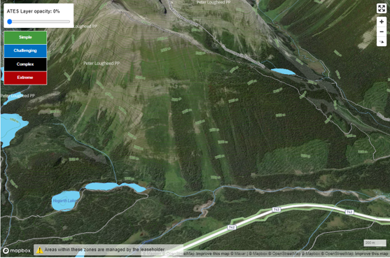
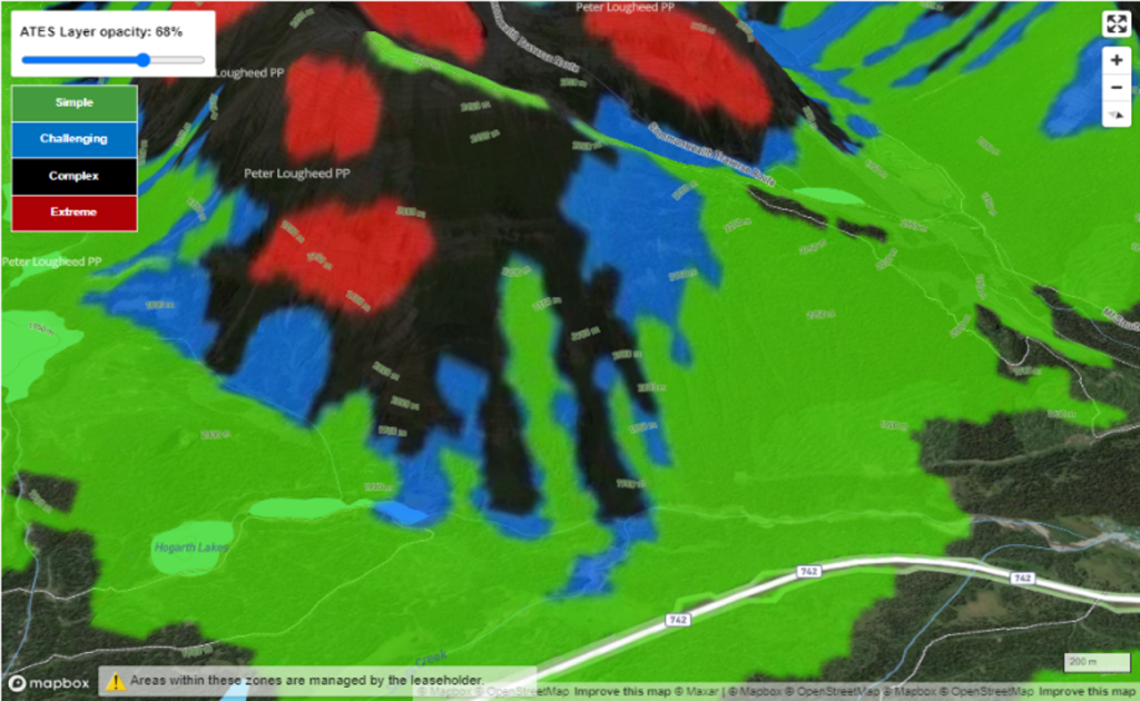
The map base is a satellite image overlayed with topographical reference. This was the first time a 3D rendering of the Kananaskis region was presented on our website and as such, we needed to be able to provide the user a “how-to” for interacting with this feature. We also gave the user the ability to control the opacity of the ATES overlay so they could better interact with the 3D satellite imagery below. Contour lines were also added onto the satellite overlay to allow users to evaluate elevation with regards to trip-planning.
A critical part of making these changes was having staff who are tech-savvy with regards to website creation. Additional layers such as ice climbs, popular ski touring objectives, and common waypoints could be added in future iterations to better help users relate the terrain to their given objective.
USER SURVEY
Moving from a list of ski tours and climbs to an interactive map seemed like a significant step forward, but there were many questions about how best to present this new product to the public. In addition to deciding on the layout and user interface, we were also curious about who was using this map and how they were using it in terms of trip-planning. As such, a survey was developed to allow us to better understand the strengths and weaknesses of the map and how we could continue to improve it moving into the future. This survey was released in late-winter 2024 and as such, only some preliminary data was collected. We continued with the survey over the 2024-25 season to get more users contributing and have higher-quality data at the conclusion. Some of the important questions we are evaluating include:
- Who uses the map?
- Is the map in its current iteration easy to understand?
- What future changes are of interest?
We have learned a few things from users since the map has been released. One common piece of feedback is the use of the colour black for complex terrain. Complex terrain in this part of the world is usually rock faces that are already dark in colour and a black overlay on a grey rock face is potentially confusing. Varying the opacity slider helps make these areas more obvious but finding a default setting for the slider to be at when the end user arrives at the website is important to consider. Or, maybe black isn’t the best colour to use in these applications? Another takeaway has been people must know the location of their trip on the map to be able to evaluate it. While trailheads and peak names are included, specific terrain features or ice climbs are not listed.
Anyone interested in participation in the survey can find it easily on the webpage at www.albertaparks.ca/ATES. We will begin to collect and evaluate this data in the fall of 2025 and hope to share the surveys contents either in Penticton or ISSW in 2026.
CONCLUSION
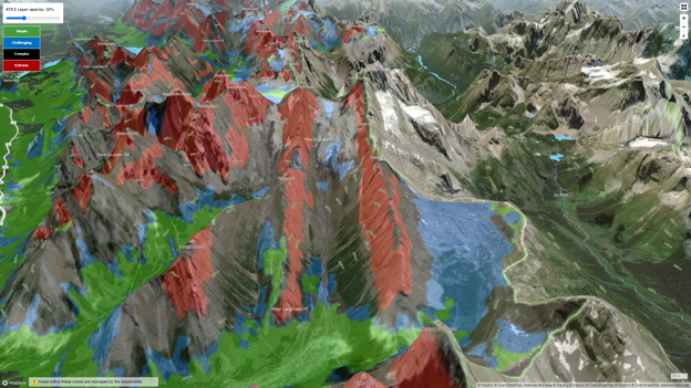
Overall, it feels like a significant advancement moving from a list that qualified Robertson Glacier as complex, with that being the only information regarding the trip, to an interactive map that shows the same trip to Robertson Glacier passes through simple, challenging, and complex terrain and is also affected by extreme areas (Fig. 2). The hope is that if people are planning to recreate in this terrain in the winter (especially users new to the area), they would open the map to get that big picture look at what type of terrain they would be in. Combining this information with the bulletin will hopefully enhance decision-making.
ABOUT THE AUTHOR
Mike is a Mountain Rescue Specialist with Alberta Parks based in Canmore, Alberta. He has over 25 years of experience working in the Kananaskis Region and is a member of the CAA and ACMG. Mike actively supports using social media to enhance public avalanche awareness and safety.